A restaurant is not just a place to eat food or to taste, the ambience and the interior of the restaurant also matter. Restaurant interior design, colour wields a powerful influence. It shapes mood, strengthens the brand, and stirs appetite.
Colour doesn’t just decorate a space—it guides how people feel, think, and behave. It can spark energy, build comfort, or slow things down. A successful design uses colour to craft the full dining experience.
The Role of Colour in Restaurant Interiors
A strong colour scheme does more than please the eye. It sets the tone and tells guests what to expect. Colour can brighten a space, hush it, or stir excitement. It helps build a mood—relaxed or lively, casual or classy.
Colour also directs how people move through the restaurant. It carves up space, separates zones, and draws focus to key spots like the bar, counter, or kitchen. With clever planning, colour weaves the space together and creates a smooth, well-balanced design.
Choosing Restaurant Colours for Ambiance and Branding
Choosing restaurant colours for ambiance and branding starts with knowing the brand’s voice. What does the restaurant stand for? What story does it tell?
- A wellness café might lean into green to reflect nature and health.
- A luxury dining room might settle on deep navy or charcoal to signal class.
- A fast-food spot might splash red and yellow to spark hunger and energy.
Every colour must echo the restaurant’s identity. Guests should walk in and feel the brand without reading a sign. The colours on the walls, in the lights, and on the furniture must all sing the same note.
Branding also reaches into menus, signs, uniforms, and even plates. When all these pieces use a clear and consistent palette, the brand becomes strong and memorable.
In this way, restaurant interior design becomes not just art—it becomes strategy.
Popular Colour Choices and Their Effects
Each colour stirs a different feeling. In restaurant interior design, you want colours that strike the right chord with your audience.
Red and Orange
Red grabs attention. It races the heart and sparks hunger. It suits fast-paced places where quick service and high energy rule. Orange brings friendliness and warmth. Together, they flood a space with movement and joy.
These colours often fill burger joints, diners, and chain restaurants. They keep guests buzzing and drive fast table turnover.
Blue and Green
Blue cools the space and calms the mind. It builds trust but often dims the appetite. Still, it fits seafood restaurants or beachside cafés that want to reflect the sea.
Green breathes life into a room. It links to nature, health, and balance. Fresh green tones match well with clean eating and eco-friendly brands. Dark greens add comfort and depth.
You’ll often find green in vegan cafés, smoothie bars, and plant-filled interiors. Pairing green with wood and stone creates a peaceful, earthy feel.
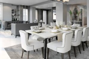
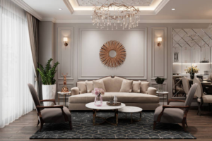
Earth Tones and Neutrals
Earth tones like brown, beige, and soft grey settle the space. They support a calm mood and allow the food and décor to pop. These colours suit fine dining and minimalist restaurants.
Neutrals let textures shine—wood grain, stone, leather, and linen. They invite warmth without stealing attention. Earthy tones also create a timeless style, ideal for long-lasting design.
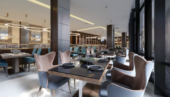
Black and White
Black adds drama, weight, and boldness. It brings elegance when used with care. White brightens a space and speaks of purity and simplicity.
Used together, black and white build a strong contrast and a modern edge. This combo works well in upscale restaurants, cafés, and boutique eateries.
A skilled Singapore interior design firm will know when to blend these shades and when to hold back. The balance makes all the difference.
Colour and Lighting
Lighting shifts how colours appear. A rich green may fade under bright light. A deep red might darken too much in dim spaces. Light changes colour—and changes mood.
Daylight shows colours in their true form. Warm lights add softness, cosiness, and warmth. Cool lights sharpen edges and bring a clean, fresh tone.
In smart restaurant interior design, lighting works with colour to lift the space. Designers place softer lights in dining zones to slow the pace and relax guests. Brighter lights suit service areas, kitchens, and entries.
A top Singapore interior design firm always tests paint and fabric in different lighting. They check colours at midday, dusk, and night to see how they shift. This extra step saves money and avoids design regrets.
Cultural Influence in Colour Selection
Singapore blends cultures. Colour meanings vary across backgrounds. A colour that means luck to one group might suggest a warning to another.
Red, for instance, means celebration and joy in Chinese culture. But in some cultures, it hints at danger. White can mean peace—or mourning. Gold often stands for wealth and honour.
A smart Singapore interior design firm knows these meanings. They choose colours that suit the space, respect the audience, and still keep a fresh look.
Restaurants that serve global guests or local communities must tread carefully. Cultural understanding turns good design into great design.
Tips for Choosing the Right Colours
Know Your Brand
Your colours must match your story. A family diner won’t feel right in dark grey. A fine dining room won’t shine with neon. Define your message, then choose colours that tell that tale.
Understand Your Audience
Think about who eats at your restaurant:
- Teens may enjoy bold, daring colours.
- Older guests often prefer soft, classic tones.
- Families enjoy cheerful, light-filled rooms.
- Business diners seek clean, modern design.
Match your colour palette to the people you want to welcome.
Use Colour to Guide Flow
Colour can direct guests without signs. Bright tones at the entry invite guests inside. Warm colours in dining zones encourage comfort and connection. Soft, cool colours in hallways or restrooms help reset the mood.
Use colour to pull attention where you want it—towards the bar, menu boards, or table seating.
Test Before You Commit
Before finalising any colour, test it on the actual wall. Watch it under daylight and night lights. Place it near your floors, tables, and lights. Small changes in texture or lighting can change the whole look.
Work With Professionals
An experienced Singapore interior design firm brings more than style—they bring solutions. They know what works in different spaces, budgets, and styles. They guide you through codes, materials, suppliers, and even maintenance planning.
Designers also stay sharp on trends. They help you avoid dated colours or unsafe choices. They think ahead and build interiors that grow with your business.
Working with professionals saves time, avoids stress, and ensures your design stands strong for years.
Final Thoughts
A good colour scheme helps your restaurant glow. It turns blank walls into a brand. It shapes mood, tells your story, and leaves a mark on every guest.
In restaurant interior design, colour holds power. Use it with care. Let it support your food, your message, and your space.
Take your time when choosing restaurant colours for ambiance and branding. Think about light, culture, function, and mood. Then team up with a trusted Singapore interior design firm to bring it all together.
With the right mix of colour, light, and vision, your restaurant can charm new guests, build loyalty, and thrive in the long run.
Also Read: How to Design a Flexible Office Space That Adapts to Different Work Styles?